Ember & Oak
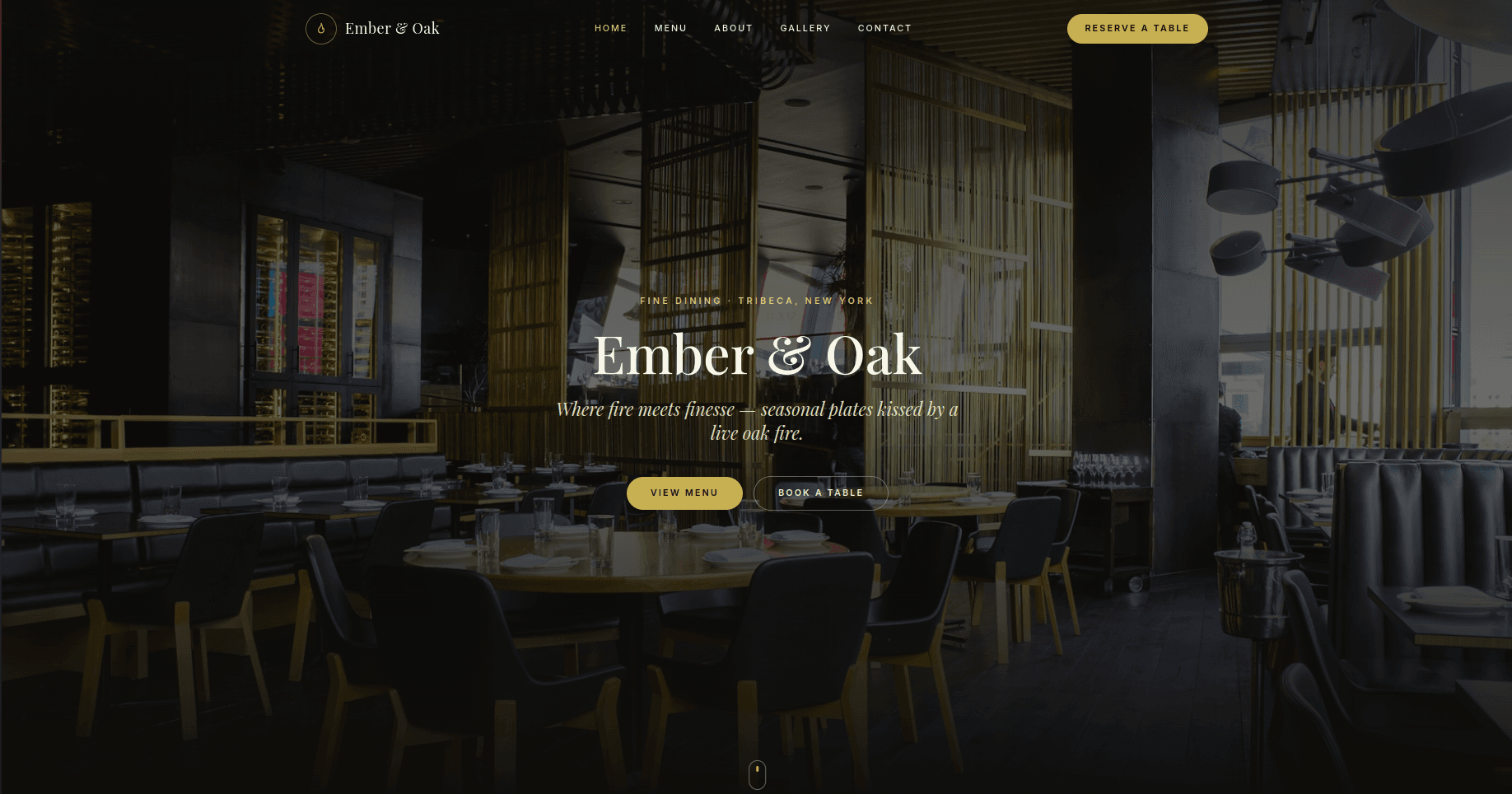
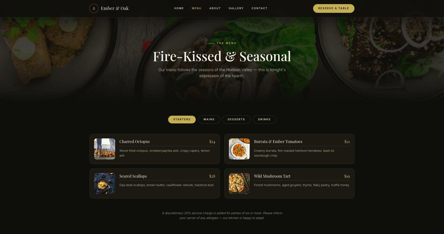
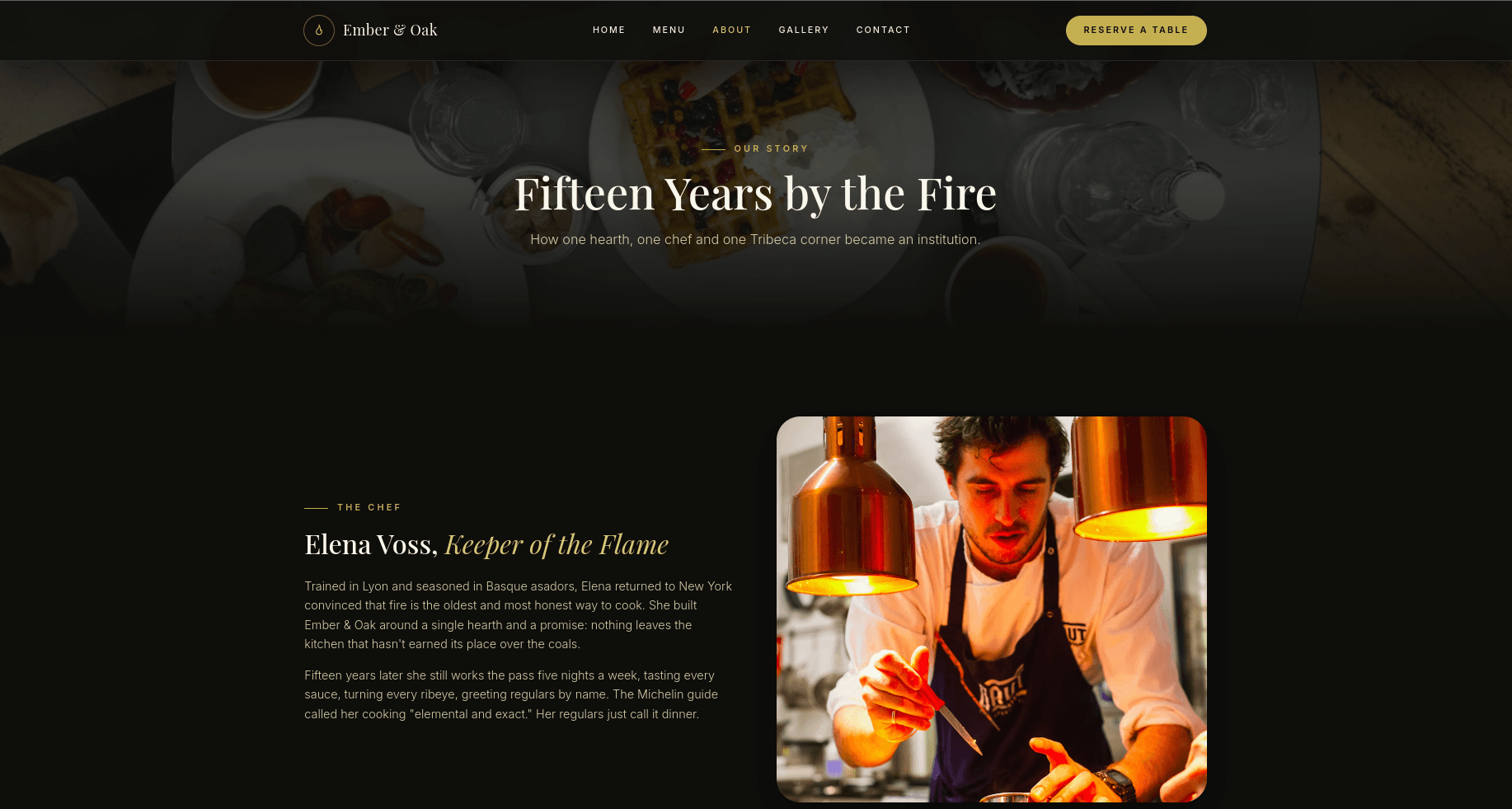
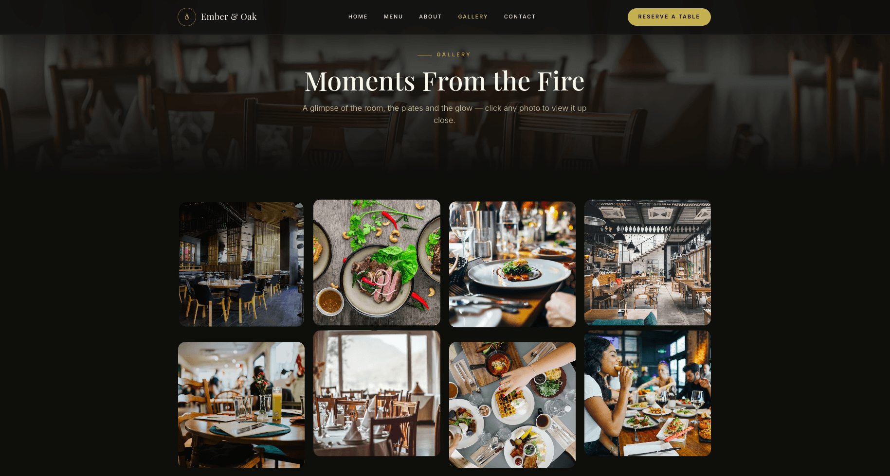
Marketing and reservations site for a fine-dining restaurant (client name withheld) — a moody, editorial brochure site built around the room and the food: a full-bleed hero, a tabbed menu with pricing, a chef's-story about page, a click-to-expand photo gallery, and a reservation page with a booking form and the restaurant's hours and address.
Role Front-end design & build — full site, reservation form, deployment
Problem
The restaurant's existing web presence undersold the room and the food — no way for a prospective diner to browse the menu with real pricing, feel the atmosphere before walking in, or reserve a table without picking up the phone. The brief was a site with the same editorial weight as the dining room itself.
Architecture
- H01
Editorial tone over generic restaurant-template tone
Serif display type, a single warm accent color, and full-bleed photography carry the same weight across every page — hero, menu, about, gallery — so it reads as a considered brand rather than a swapped-logo template.
- H02
Reservation without a call
The booking form captures party size, date, time, and special requests directly, sitting next to hours and contact details, so a diner can book without ever picking up the phone.
- H03
Menu as a selling tool, not a PDF
Tabbed categories with dish photography and pricing let a prospective diner browse the actual menu in-browser instead of downloading a static PDF, which is what most restaurant sites default to.
Product gallery

Key features
- 01Full-bleed hero with a moody interior photo, name, tagline, and dual CTAs (view menu / book a table)
- 02Tabbed menu (starters, mains, desserts, drinks) with per-dish pricing and description, backed by real dish photography
- 03About page telling the restaurant's and chef's story, paired with a portrait of the chef at work
- 04Click-to-expand photo gallery of the room, plated dishes, and the dining experience
- 05Reservation form (name, phone, party size, date, time, special requests) alongside address, phone, email, and hours
- 06Consistent dark, editorial visual language (serif display type, warm gold accent) carried across every page
Status
Delivered and live for the client — the design brief called for something that reads as an established fine-dining institution, not a template.
An idea, an existing app, or something in between?
Tell us what you're trying to ship. We reply within one business day with a written take on scope and timeline, not a sales pitch.